Join us behind the scenes of Formula 1: our reporters were present at every Grand Prix in 2025, including Miami. We write about our experiences not only online, but also in our magazine. Part 6 of 24: André Venema on unique Ferrari colours.
Special liveries are a (nearly) timeless tradition. There are numerous examples of successful aesthetic, temporary colour schemes. This year’s white Red Bull in Japan, a gesture of gratitude to Honda and the Formula 1 racing history of the engine supplier, was one such example in my opinion. Ferrari, on the other hand, once again proved that it does not master this art.
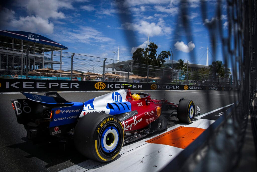
What would Enzo Ferrari, Il commendatore, have thought of the livery that his brainchild presented to the world with great aplomb in Miami? Would he have vetoed it upon seeing the first sketch? The additional blue and white accents from title sponsor HP and the scarlet red of the sports car manufacturer clashed under the Florida sun.
A Mishmash
‘A complete failure,’ is how a former F1 driver of note described the (hopefully) one-off colour scheme of the SF-25. You wouldn’t expect such a thing from a company from a country where design is elevated to an art form. The car looked like a mishmash, although the press release preceding the Miami GP claimed that ‘the special design reflects the evolution of the partnership and the joint efforts behind it’. For the first time in Ferrari’s history, the press release further stated, there were ‘asymmetric graphic elements’ visible on one of the F1 cars.
It was nothing more than high-flown marketing language. In Miami, I didn’t hear anyone who actually liked the colour scheme. The problem is that teams usually don’t dare to make hard choices with one-offs, but instead take a half-hearted approach to please everyone. In Miami, there was only one car that deserved the beauty prize with a dazzling livery. Well done Racing Bulls. That’s how it should be: Made in Italy.


