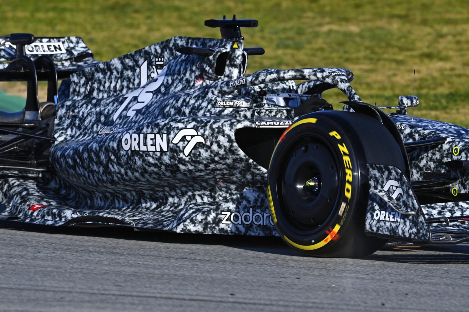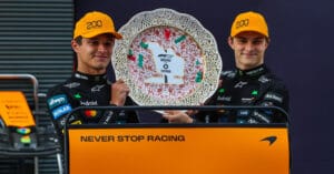
In the lead-up to the Formula 1 season, there is a flurry of special livery reveals, culminating in the F1 75 event next Tuesday – colours make the car. As a warm-up, we delved into the archives of F1 liveries over the years. In part 1, we saw those with a Dutch touch, in part 2 the liveries of iconic and colourful nature.
Taste is also a matter of debate in Formula 1. Although this applies to liveries as well, some historical colour schemes stand head and shoulders above the drab average. With the team presentations in mind, we take a closer look at a few.
Iconic Black
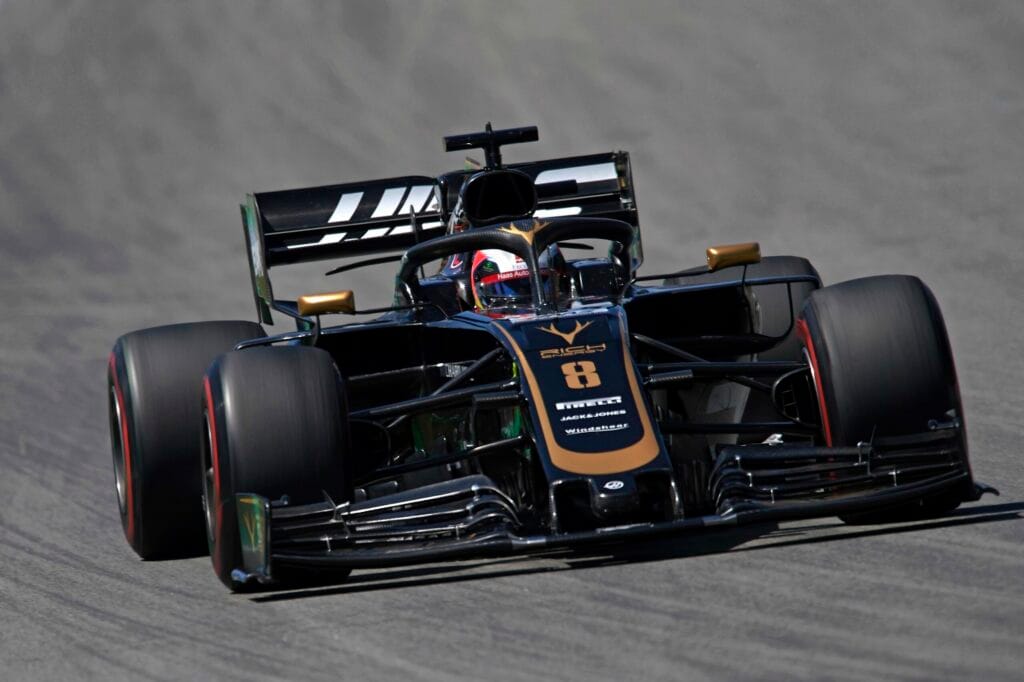
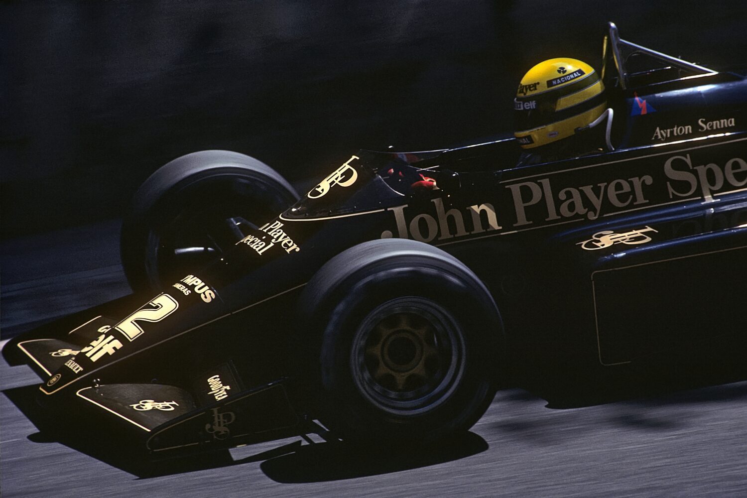
When Haas teamed up with Rich in 2019, Formula 1 was almost swooning. With the black-gold VF-19 that the American team presented (photo above), it seemed like the times of the iconic Lotuses with their black-gold John Player Special liveries were returning to the paddock. Nothing could be further from the truth: Rich Energy turned out to be a farce and a year later the Haas cars were boring grey again. A pity, because the partnership not only produced juicy stories but also a beautiful car, comparable to Ayrton Senna’s Lotus 97T and Jody Scheckter’s Wolf WR1. That black not only looks good with gold is evident from the Arrows A19 and the Sauber C14.
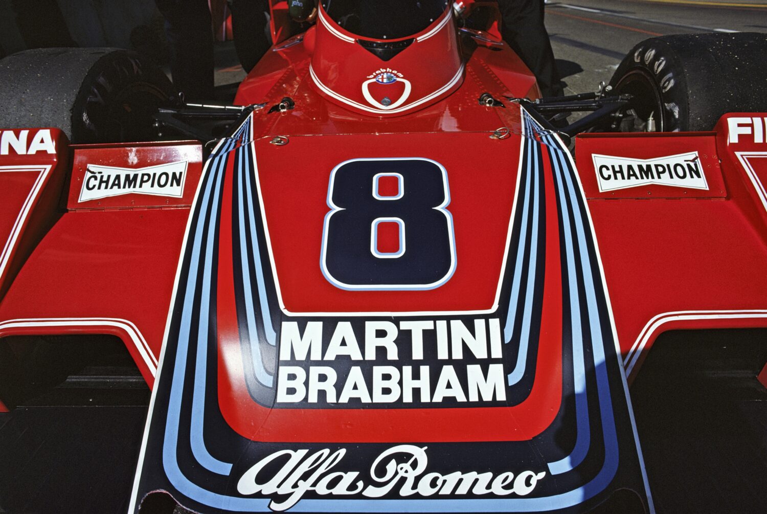
Martini & Rossi
When Martini announced in 2014 that it would become the main sponsor of Williams, the reactions were unanimously positive. Opinions on the taste of the drink vary – we can’t all be James Bond – but Martini colours make any car look better. Just look at this Brabham from 1976 and Lotus from 1979.
Scarlet Red
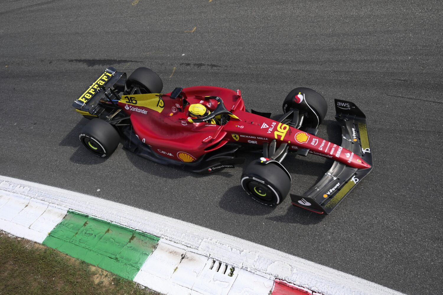
The most boring livery in Formula 1? Ferrari has been racing in red since 1950, with occasional deviations (yellow for Gendebien, blue-white for N.A.R.T.). It’s no wonder Enzo Ferrari once said, “Ask a child to draw a car, and they will undoubtedly color it red.” The main debate among tifosi is which shade of red and in combination with which other colors: the Rosso Scuderia with white from the Schumacher years or the Rosso Corsa with black from the Prost, Alesi, and Berger era. Our preference leans towards the red-black combination that has made a comeback in recent years.
Tobacco
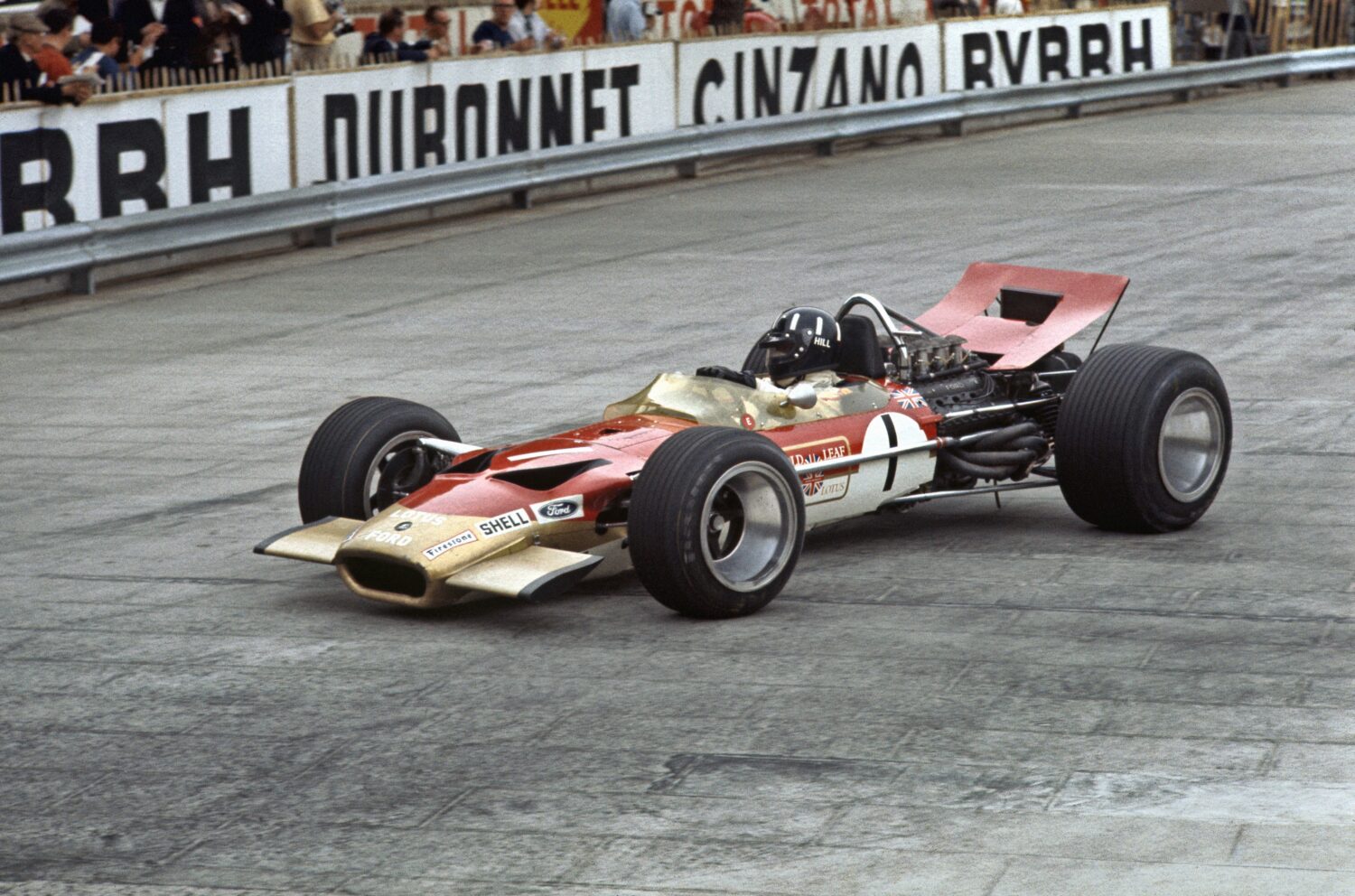
There was a time when smoking was the norm and tobacco advertising was widely accepted, including in Formula 1. Until 1968, sponsorship logos on cars were prohibited, but financial difficulties led the FIA to allow advertising. The first to seize this opportunity was Colin Chapman. The team boss of Lotus signed a contract for 85,000 British pounds with Imperial Tobacco. The originally green and yellow Lotus 49B was entirely repainted in red, gold, and white, the colors of the Gold Leaf cigarette brand. Colors define the car, but so does advertising.
A few years later, McLaren partnered with Marlboro, resulting in unforgettable liveries. The red and white collaboration lasted until 1996. In the nineties, almost the entire grid was adorned with tobacco advertising. This included BAR, which, in true American fashion, wanted to race with two different liveries. The FIA put a stop to this, leading BAR to decide to paint the two liveries on one car instead.
Art, Not Just Advertising
Why not take a leap and ask an artist to paint your Formula 1 car? Red Bull, in particular, has made a habit in recent years of presenting the new car for the season in an artistic guise. They did this, for instance, this year with the Mr. Doodle RB19, and previously with the RB15. Alfa Romeo has also emerged from its winter hibernation in an artistic fashion a few times in recent years with some remarkable art cars. However, one of the most beautiful art liveries is undoubtedly the Ligier JS39 from 1993. Main sponsor Gitanes was going through a blue phase and came up with this masterpiece.